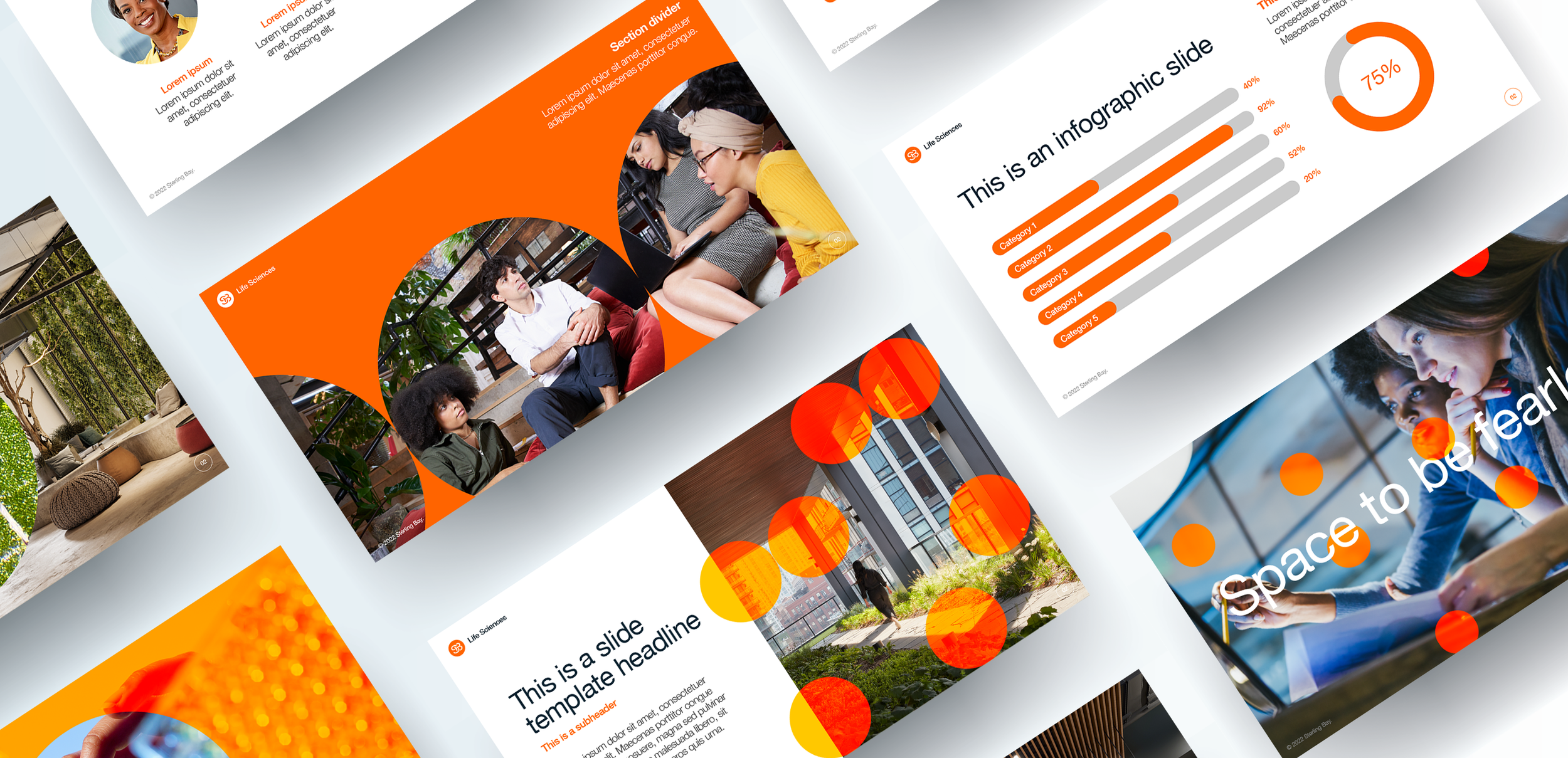
Guided by the motto Space to be Bold, inspiration emerged from Sterling Bay’s existing logo and initials to develop a brand aesthetic that balanced confident expression with the spirit of scientific exploration. By building on their established identity and introducing fresh, experimental visual systems, we pushed creative boundaries—challenging conventional life science branding and inviting the client to embrace more daring, future-facing design.
While the final implementation landed in a more restrained space, the process demonstrated how far life sciences branding can evolve when clarity, confidence, and creativity intersect. The result was a scalable visual language that translated complex scientific ambition into human-centered design—bridging real estate, research, and emerging biotech culture. This project reflects my approach to brand systems in regulated environments: stretching visual identity with intention, balancing innovation with strategic rigor, and delivering creative frameworks that enable growth in uncharted territory.